By default, git diff looks not that good as it could be. If you use GitHub,
you can see how good it can looks. We’ll try to achieve something similar to
Github’s diff.
Diff-highlight
diff-highlight is a contributed tool which shows better diff by comparing
strings by character.
So, if your diff looks like:
- hello, world
+ hello, people
It will highlight world as old (red background) and people as new
(green background).
You can grab the script here and install it by placing it to /usr/bin/
Diff-so-fancy
This project makes diff looks much better!

On the left side, it’s the default diff. On the right side, it’s the diff
with diff-so-fancy.
You can install it by npm install -g diff-so-fancy. This will install diff-
highlight as well.
For more info, see the github project.
I’m using Forest scheme for terminal, so the config suggested by diff-so-fancy looks not that good. I’ve picked some nice colors, so if you’re using Forest as well, enter these commands instead of the suggested:
git config --global color.diff-highlight.oldNormal "red"
git config --global color.diff-highlight.oldHighlight "red 217"
git config --global color.diff-highlight.newNormal "green"
git config --global color.diff-highlight.newHighlight "green 157"
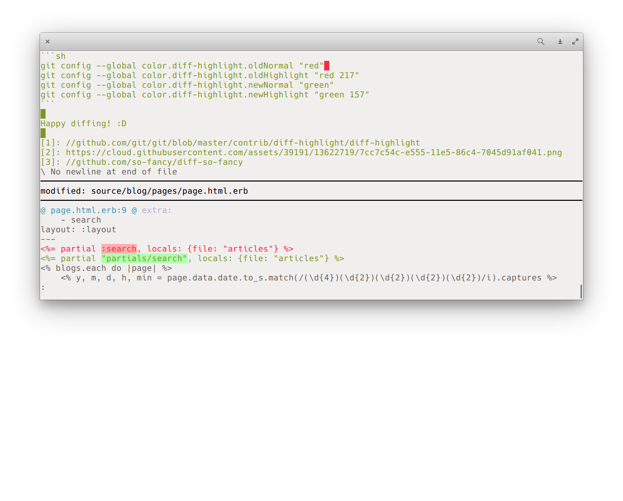
Happy diffing! :D